
Tag Archives: Type Classification
A new serif in town: The fonts used on London’s signs and shops have an army of fans – This Britain – UK – The Independent
Filed under Uncategorized
Type classification project


Having spent days reading about classification, typeface design and various typefaces that I’ve chosen to include in the assessment publication, I’ve finally started creating something. Firstly, I’ve been thinking about format. How can I do something more interesting than a saddle stitched booklet. I looked at some examples that I had at home of brochures, flyers, catalogues etc and thought that a good format would be a series of A5 postcards bound in some way. Maybe with a simple band or perhaps a spiral. As the brief is to produce something as an educational tool, I like the idea of loose postcards as you can imagine them being distributed around a class. While the brief asks for a “book”, does that necessarily require a set of bound pages? I also like the postcard form as it is a limited space that forces you to edit content down to the minimum and to be creative with layout. It also give the opportunity for lovely bled images on one size…
The document will be divided into three sections:
- Description of type classifications – I’ll mention the various classifications that have been tried, but then describe in more detail the Vox classification (see below for what I have in mind)
- Glossary of descriptors – showing diagrammatically all the terms there are to describe type. I have identified three classes of term, and will divide this section up accordingly. These are (a) Indicators of type size (body, x-height etc); (b) Elements of the form (ascender, descender, ear, chin etc). Have you noticed how many of these terms are parts of the human body; and (c) How the form is drawn (terms such as stress, contrast, stroke)
- Personality of each typeface
I’ve made a start on section 1 and have designed the front of each card. What I want to show on each is a particular defining feature of the classification. For example, the inclined cross bar on the e in Humanist/Venetian faces, the verticality and hairline serifs in Didones, the different direction the extension on the lower case e points between a Humanist sans serif and a Neoclassical. The reverse of the card will have a description of the classification and examples of typical typefaces.
Click here to see 15 postcards I’ve done for the Vox classification. I am working with the extended Vox+ classification that Joep Pohlen discusses in detail in his book The Letter Fountain. Please let me know what you think… I think there could be more colour, or should I just do black & white? What do you think of the idea? Does it make the point?
The typefaces used are:
- Humanist – Centaur
- Geralde – Bembo
- Transitional – Baskerville
- Didones – Didot
- Slab – Clarendon (two slides as not sure which one shows the slab serifs better)
- Humanist sans serif – Gill Sans
- Neoclassical sans serif – Helvetica
- Benton sans serif – Franklin Gothic
- Geometric sans serif – Futura
- Glyphics – Albertus (first slide); Trajan (second slide). Again not sure which one to use!
- Scripts – Zapfino
- Graphics – Brush
- Gothics – Fraktur
Filed under Uncategorized
Typeface anatomy
I took delivery of a beautiful book today, Letter Fountain by Joep Pohlen. It’s described as the ultimate typeface reference book and it’s gorgeous! Comprehensive and beautifully produced. You can also look at the companion website at http://www.thisisnotawebsite.nl. He includes lots of detail about typeface anatomy that I’m hoping to include in my typeface classification project. If you’re going to buy the book, to so from Amazon as its £15 cheaper!
One letter that you’d think was quite simple but can be more complex that you’d image is the x. I’ve just done a small composition on the Frutiger lowercase x. It’s more asymmetrical that at first glance!

Filed under Uncategorized
Typeface anatomy
I’ve been making a start on the Type Classification project. Yesterday I spent some time trying to understand the various classification systems that are used, which to be honest are rather confusing. There seem to be so many iterations of the historic classifications. You have the basic Old Style, Transitional, Modern trio which are then divided into serif and sans serif plus the Slab serifs and Grotesques. But then some classifications go even deeper, dividing Old Style into Humanist (Venetian) and Geralde (French) faces… Some call Modern Didone… Some lump all the sans serifs into a Lineal classification which is then sub-divided into Humanist (loosely based on the serif forms of the same classification), Geometric (Futura, for example) and the Grotesques. Then of course you’ve the Blackletters and script/calligraphy typefaces on top of this. The article I posted yesterday suggests some ideas for different classifications but I’m not even sure that these are that practical. Why not classify typefaces around what they are designed to be used for and work from there… So enough of my ranting about classification systems… I’ve chosen a number of typefaces to look at for this project and based my decision on the traditional classifications and within these selected typefaces that I have used or come across for a particular reason. This is what I am going to work with:
Old Style: Bembo
Transitional: Bulmer (this was used in my wedding invitation last year so has sentimental value – the quote on the homepage is an extract from it) and Times New Roman
Modern: Bodoni
Slab Serif: Memphis
Humanist Sans: Frutiger (I used this in my PAC project and have become rather attached to it!)
Geometric Sans: Futura
Grotesque: Franklin Gothic
I’ve made a start looking at the first three, printing out the lower and upper case alphabets and looking at these. I then made an interesting discovery that led me down an alley. For Bodoni I had selected the ITC version “cut” in 1994 as I had read in Robert Bringhurst’s excellent The Elements of Typographic Style that this was the closest to the original cut by Bodoni himself. I was troubled by this version as it did not seem like the Bodoni I was familiar with. I recalled unbracketed hairline serifs and very clean lines which this version did not appear to have. It seemed less open, with smaller counters. Bringhurst also mentions Bauer Bodoni as another favourite and fortunately I had this version as well. I put them both on screen and was struck by how different they looked. The latter was the Bodoni I was familiar with.
ITC BODONI

BAUER BODONI

I’ve then done some more experimentation in Illustrator on particular letterforms both to highlight some of the differences and also to see if there is method I could use across this exercise. Here’s the results on the uppercase J, Q and H and lowercase a. The black letterforms are ITC and the red Bauer:

In the J, note the different descenders and serifs. The cap height of the letter is different as well – Bauer is a higher. With the H, note the different length of the crossbar. The a has very different shaped counters and the overall shape of the letterform is different – Bauer is flatter. With the Q, note the different size counters, the different stroke width and, most interestingly, the very different tail shapes.
Filed under Uncategorized
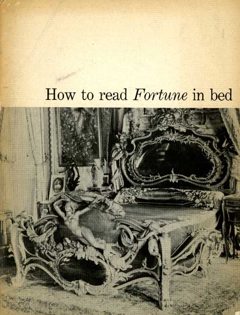
When Fortune Reigned on Wall Street
Filed under Uncategorized
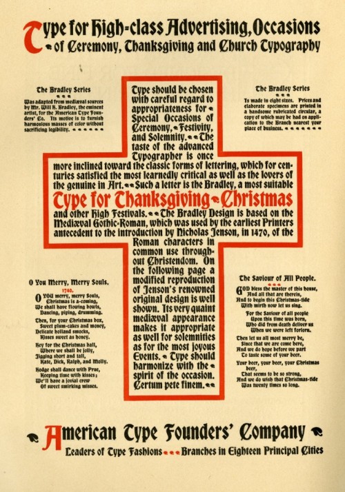
Religious Types
Filed under Uncategorized
